Plotting Xively timeseries data using Rickshaw
Xively (formerly Cosm, formerly Patchube) now has a Javascript library for their API. I have been meaning to learn the Rickshaw library for awhile as it comes highly recommend from several people. It turned out to be a doddle to use. I just mixed in the moment.js library to do some date munging and was able to knock up some graphs in an hour or so.
Air Quality Egg
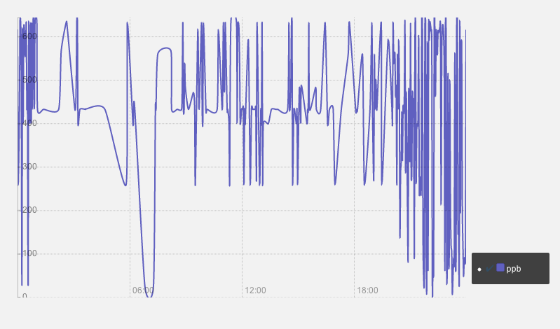
AirQualityEgg NO2 data
Current cost electricity usage
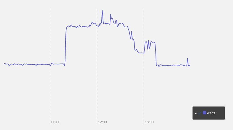
Current cost electricity data
These two data source aren’t pumping out data anymore but you can see an example here.
The code
This file contains bidirectional Unicode text that may be interpreted or compiled differently than what appears below. To review, open the file in an editor that reveals hidden Unicode characters.
Learn more about bidirectional Unicode characters
| xively.setKey( "YOUR API KEY HERE" ); | |
| var startOfYesterday = moment().subtract("day", 1).startOf('day'); | |
| var endOfYesterday = moment().startOf('day'); | |
| console.log(startOfYesterday); | |
| console.log(endOfYesterday); | |
| var query = { | |
| start: startOfYesterday.toJSON(), | |
| end: endOfYesterday.toJSON(), | |
| interval: 60, | |
| limit: 1000 | |
| }; | |
| xively.datastream.history( "106267", "NO2_00-04-a3-37-cc-cb_0", query, loadData); | |
| function loadData(data) { | |
| var unit = data.unit.label; | |
| var series = []; | |
| var filtedData = data.datapoints.filter(function(x) { return (x.value < 1000); }); | |
| for (var i=0; i < filtedData.length; i++ ) { | |
| var date = moment(filtedData[i].at); | |
| var value = parseInt(filtedData[i].value); | |
| series[i] = {x: date.unix(), y: value}; | |
| } | |
| drawGraph(series, unit); | |
| } | |
| function drawGraph(data, unit) { | |
| var graph = new Rickshaw.Graph( { | |
| element: document.querySelector("#chart"), | |
| width: 640, | |
| height: 400, | |
| renderer: 'line', | |
| series: [ | |
| { | |
| data: data, | |
| color: '#6060c0', | |
| name: unit | |
| } | |
| ] | |
| } ); | |
| graph.render(); | |
| var hoverDetail = new Rickshaw.Graph.HoverDetail( { | |
| graph: graph | |
| } ); | |
| var legend = new Rickshaw.Graph.Legend( { | |
| graph: graph, | |
| element: document.getElementById('legend') | |
| } ); | |
| var shelving = new Rickshaw.Graph.Behavior.Series.Toggle( { | |
| graph: graph, | |
| legend: legend | |
| } ); | |
| var axes = new Rickshaw.Graph.Axis.Time( { | |
| graph: graph | |
| }); | |
| axes.render(); | |
| var yAxis = new Rickshaw.Graph.Axis.Y({ | |
| graph: graph | |
| }); | |
| yAxis.render(); | |
| } |
The code is also on github.


